

Understanding the Psychology Behind Spring Wedding Color Selections
Spring weddings embody renewal, growth, and the awakening of nature's most vibrant hues. The psychology behind color selection for these celebrations extends far beyond aesthetic appeal, influencing emotional responses and creating lasting memories for couples and their guests. Understanding these psychological underpinnings helps brides craft a cohesive visual narrative that resonates with their personal love story.
Color psychology plays a pivotal role in establishing the matrimonial ambiance. Soft pastels evoke feelings of tranquility and romance, while bold spring hues inject energy and vivacity into the celebration. The chromatic choices for spring wedding colors 2026 trends palette reflect a sophisticated understanding of how colors interact with human emotions, creating an immersive experience that extends beyond visual beauty.
Contemporary brides are increasingly drawn to color combinations that reflect their personalities while honoring seasonal traditions. The emerging trends showcase a departure from conventional pastel dominance, embracing more complex chromatic relationships that include unexpected neutrals and sophisticated jewel tones balanced with traditional spring favorites.
Dominant Color Trends Shaping 2026 Spring Weddings
Verdant Green Variations
Emerald sophistication takes center stage in 2026 spring wedding palettes, moving beyond basic mint and sage toward more complex green formulations. Eucalyptus silver-green offers a muted elegance perfect for outdoor ceremonies, while forest emerald provides dramatic depth for evening receptions. These verdant hues pair exceptionally well with cream, blush, and metallic accents.
The versatility of green allows for seamless integration across all wedding elements. From bridesmaid dresses in varying green intensities to personalized engraved jewelry featuring emerald accents, this color family provides endless customization opportunities. Brides are discovering that green's natural association with growth and harmony makes it an ideal foundation for their color story.
Sophisticated Coral and Peach Fusion
The evolution of traditional coral encompasses warmer undertones and increased sophistication. Terracotta coral brings earthiness to spring celebrations, while peachy-pink variations offer romantic softness. This color family works particularly well in garden settings and vineyard venues, complementing natural surroundings while maintaining wedding elegance.
These warm hues translate beautifully into personalized bridal party gifts, from custom engraved compact mirrors in coral cases to monogrammed jewelry boxes featuring peachy-pink interiors. The colors photograph magnificently in natural light, ensuring stunning wedding memories that capture the season's essence.
Lavender and Lilac Renaissance
Purple's spring interpretation moves toward sophisticated lavender and muted lilac tones rather than vibrant purples. These colors evoke French countryside charm while maintaining modern elegance. Deep lavender provides grounding for lighter palette elements, while pale lilac offers dreamy romanticism perfect for ceremony backdrops.
The lilac family pairs exceptionally with cream, sage green, and dusty blue, creating harmonious combinations that feel both fresh and timeless. These colors work beautifully for personalized wedding favors and custom bridal party accessories, offering a refined alternative to traditional pink selections.
Innovative Color Combinations for Modern Couples
Earth-Inspired Neutral Palettes
Taupe, mushroom, and warm gray foundations create sophisticated backdrops for spring celebrations. These neutral bases allow for colorful accent integration without overwhelming the overall design aesthetic. The earthiness appeals to couples seeking organic, natural wedding themes while maintaining urban sophistication.
Neutral palettes offer incredible flexibility for personalized elements. Engraved wooden accessories, custom stone-colored ceramics, and monogrammed linen goods in these tones create cohesive bridal party gifts that guests will treasure long after the celebration concludes.
Bold Jewel Tone Accents
Strategic jewel tone placement elevates traditional spring palettes into contemporary masterpieces. Sapphire blue accents against soft pink foundations create striking visual contrast, while emerald touches add depth to cream and gold combinations. These bold choices reflect modern brides' confidence in expressing their unique style preferences.
"The most memorable weddings combine unexpected color elements that reflect the couple's personality while honoring the season's natural beauty. Bold accents against soft foundations create visual interest without overwhelming the romantic atmosphere."
Monochromatic Sophistication
Single-color families explored across multiple intensities create elegant, cohesive designs. Blush ranging from barely-there pink to deeper rose creates romantic depth, while blue variations from powder to navy offer classic sophistication. This approach simplifies planning while ensuring visual harmony throughout all wedding elements.
Seasonal Influences on Color Selection
Nature's Palette Integration
Spring's natural color progression influences wedding palette development from early blooms through late spring abundance. Early spring weddings embrace softer, more delicate hues reflecting emerging buds and tender leaves. Late spring celebrations can incorporate bolder colors mirroring the season's full flowering display.
Understanding seasonal timing helps couples align their color choices with nature's backdrop, creating harmonious relationships between wedding design and environmental surroundings. This connection enhances photography opportunities and creates more cohesive celebration aesthetics.
Regional Botanical Considerations
Geographic location significantly impacts appropriate color selections for spring weddings. Desert spring weddings might embrace warmer coral and terracotta tones reflecting regional landscapes, while mountain celebrations could feature cooler blues and greens echoing alpine environments. These regional considerations ensure color palettes feel authentic and connected to the celebration location.
Practical Implementation Strategies
Incorporating Trends Through Wedding Details
Successful color palette implementation requires strategic planning across multiple wedding elements. Florals should feature primary colors while linens and decor provide supporting tones. Bridal party attire serves as a major color anchor, while personalized gifts and favors offer opportunities for accent color integration.
| Wedding Element | Color Role | Implementation Tips |
|---|---|---|
| Bridal Party Attire | Primary Colors | Use 2-3 coordinating shades within the same color family |
| Florals | Primary + Accents | Include seasonal blooms in chosen palette |
| Personalized Gifts | Accent Colors | Custom engraving on items matching palette themes |
| Table Settings | Supporting Tones | Layer different intensities of primary colors |
Personalizing Through Custom Elements
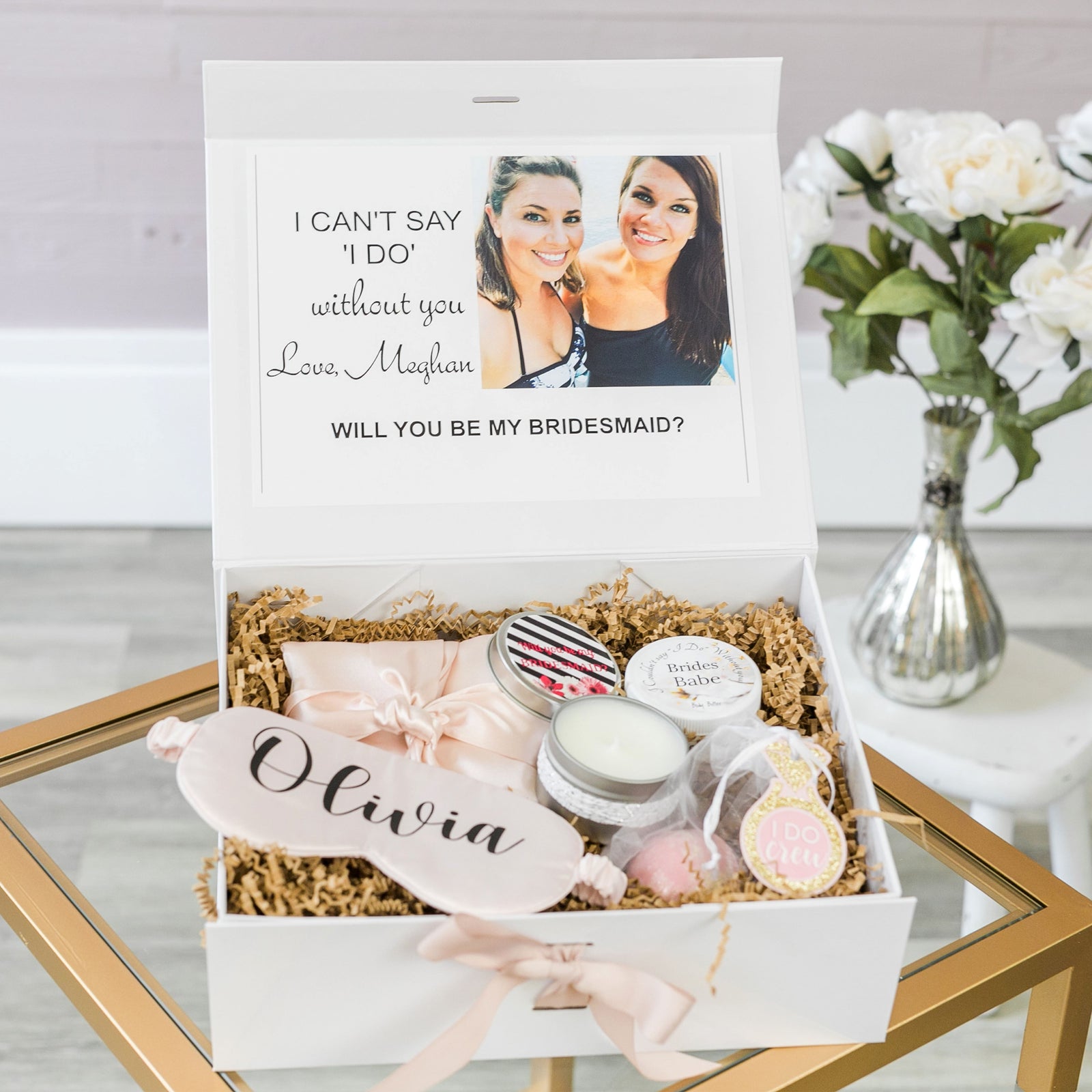
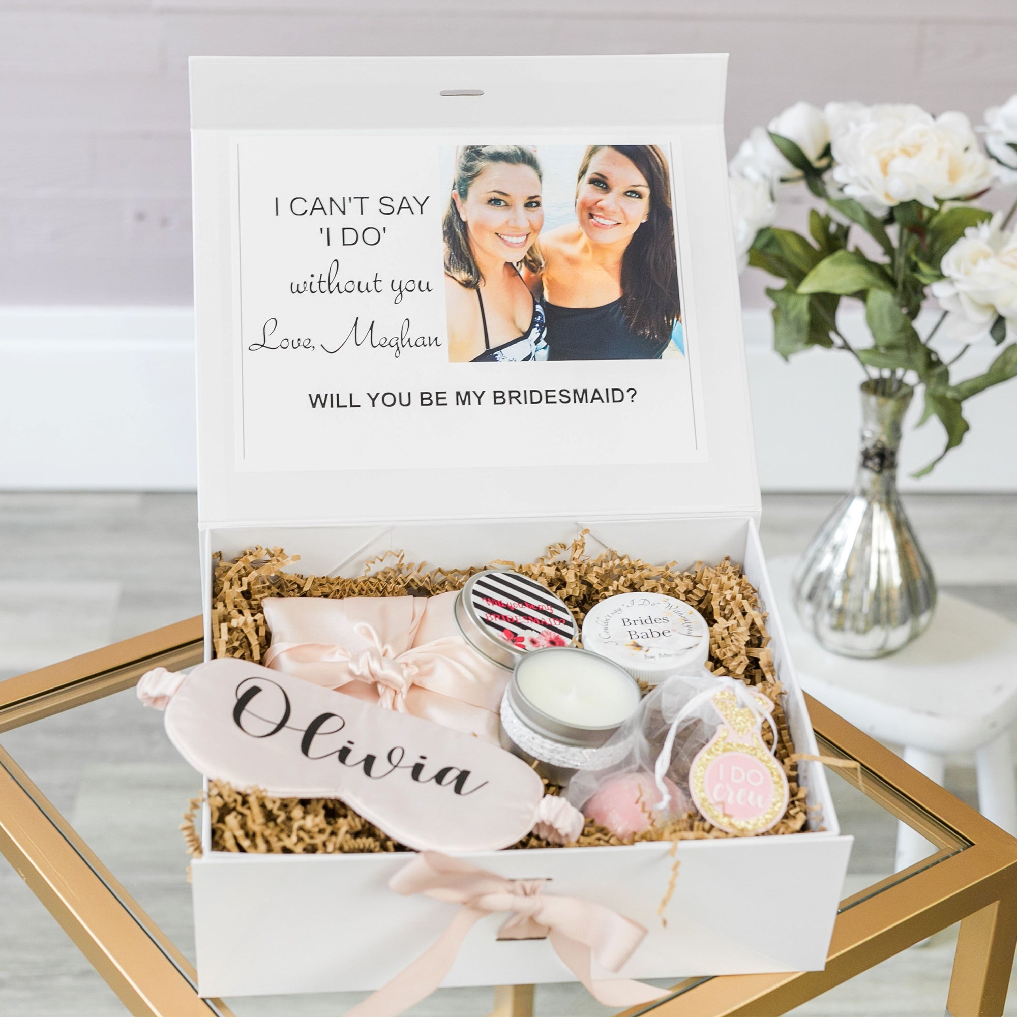
Personalized bridal party gifts offer perfect opportunities for color palette reinforcement while creating meaningful keepsakes. Custom engraved jewelry featuring colored stones, monogrammed accessories in palette colors, and role-specific gifts designed around chosen hues help tie the entire celebration together while honoring individual bridal party members.
Consider these personalization approaches:
- Engraved jewelry boxes in palette-coordinated colors
- Custom compact mirrors with colored accents
- Monogrammed robes featuring chosen color combinations
- Personalized drinkware incorporating wedding colors
- Custom wedding day emergency kits in coordinated containers
Budget-Conscious Color Implementation
Achieving trendy color palettes doesn't require unlimited budgets. Strategic color placement in high-impact areas maximizes visual effect while controlling costs. Focus primary colors on elements that appear in most photographs: bridal party attire, bouquets, and ceremony backdrops. Use accent colors sparingly in details like napkins, candles, and personalized favors.
DIY elements offer budget-friendly color integration opportunities. Hand-painted signs, custom-colored candles, and personally crafted favors allow couples to incorporate trendy colors while adding personal touches that reflect their creativity and dedication to their celebration.
Frequently Asked Questions About Spring Wedding Color Trends
How many colors should be included in a spring wedding palette? Most successful palettes include 3-5 colors: one primary color, 1-2 supporting colors, and 1-2 accent colors. This provides variety without creating visual chaos.
Can bold colors work for morning spring weddings? Absolutely. Morning celebrations benefit from energizing colors that complement natural morning light. Consider coral, sunny yellow, or fresh green as primary colors with softer supporting tones.
How do metallic accents fit into spring color schemes? Metallics serve as neutral elements that enhance rather than compete with chosen colors. Gold complements warm palettes, while silver works well with cool tones. Rose gold bridges warm and cool combinations beautifully.
What's the best way to test color combinations before committing? Create physical sample boards with fabric swatches, paint chips, and floral examples. View these samples in different lighting conditions to ensure colors work harmoniously throughout the day.
How far in advance should color decisions be finalized? Color palettes should be established 8-10 months before the wedding to allow adequate time for dress ordering, vendor coordination, and custom element creation. This timeline ensures all elements can be properly coordinated without rushing.
Spring wedding color palette trends for 2026 embrace sophistication, personalization, and natural harmony. By understanding color psychology, seasonal influences, and practical implementation strategies, couples can create memorable celebrations that reflect their unique love stories while honoring the season's inherent beauty. Whether choosing bold jewel tone accents or soft monochromatic schemes, the key lies in thoughtful planning and strategic color placement throughout all wedding elements.


